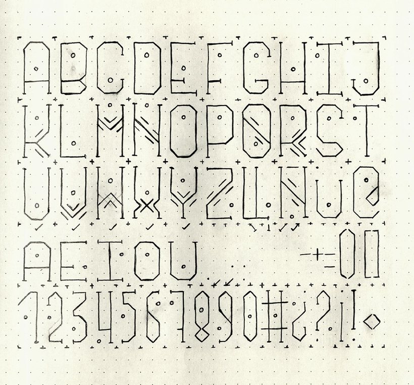
Pattern Typography
A creative exploration into decoding and rebuilding the anatomy of the Latin alphabet. I broke each letter down into its structural lines, strokes and connection points, studying what makes every character unique and what the whole alphabet has in common, then used that analysis as the base for a new, systematized approach to typography: one that turns familiar letterforms into abstract, geometric pattern.
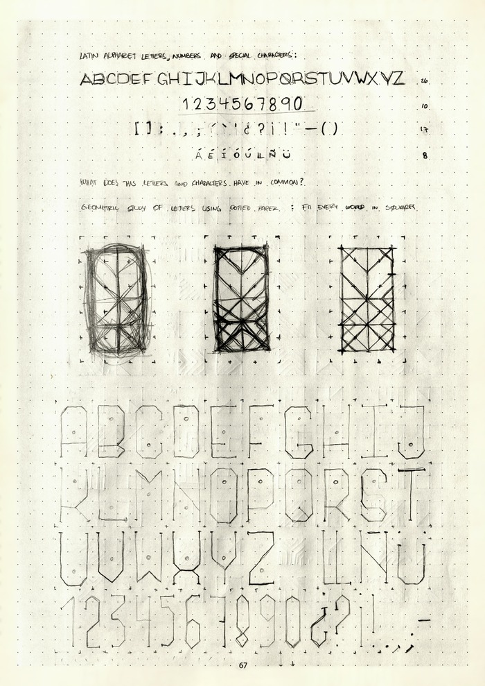
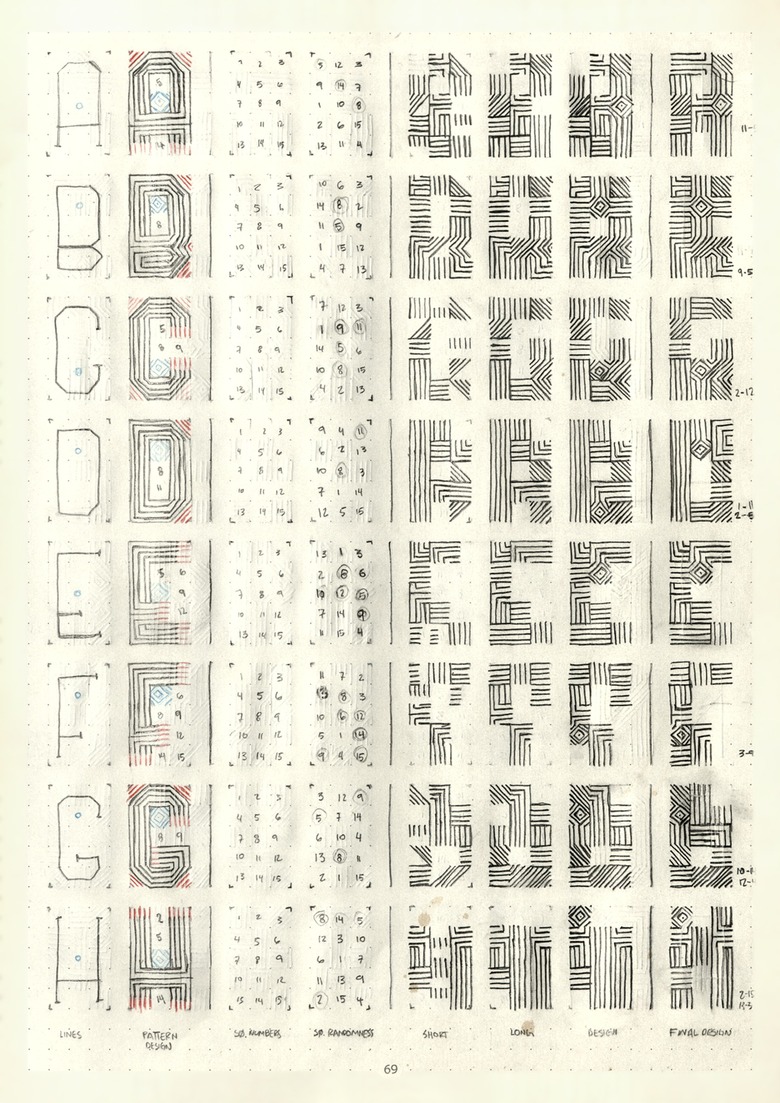
The first step was setting up a consistent framework: a 5x3 square grid that would hold every letter. Working on dotted paper, I mapped the Latin alphabet, the Spanish accented characters, numbers and punctuation onto that grid, fitting each one into its own set of squares. The grid kept proportion and alignment consistent across the whole alphabet while I pushed how far each form could be reduced.
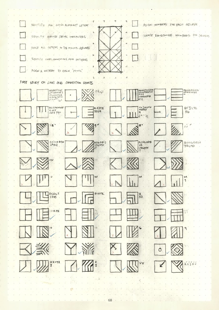
The goal was to represent each letter with the fewest possible lines, the same logic behind early digital clocks, which display numbers with a handful of basic strokes. To push it further, I assigned a number from 1 to 15 to each square in the grid, then used that numbering to generate randomized sequences deciding which segments would appear in each version of a letter. It's a rule-based method with an unpredictable result: short sequences, long sequences, and a final design, worked out letter by letter until the whole alphabet had its own reduced pattern.

Some of these letter patterns were expanded into full words and phrases, compositions that read more like encrypted code than typography. The results are abstract patterns that still hold a connection to their typographic origin, sitting somewhere between legibility and visual rhythm. It turned into a new visual language, one that hides meaning in plain sight and invites whoever's looking at it to try to decode it.
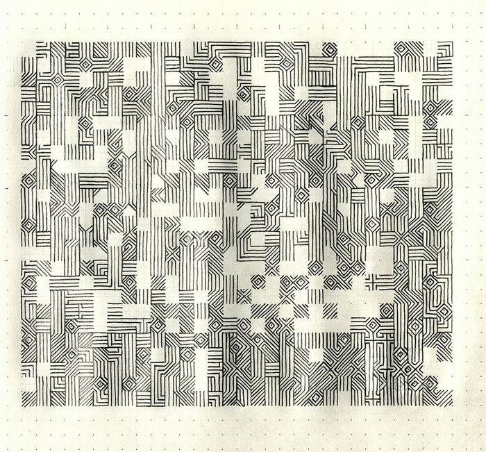
Ten stages of the same composition, from the plain letterforms to the fully encrypted pattern. Step through them to see how the system builds up.